
Pearl & Co.
Timeline
4 Months
Tools
Adobe Creative Suite, Figma, Pacdora
Challenge
The tinned fish market is getting popularized online, with premium and artisanal options trending among Millennials and Generation Z. However, mainstream brands often overlook cultural authenticity and modern design appeal. The challenge was to differentiate Pearl & Co from its mass-market competitors by capturing its unique Filipino heritage while appealing to a younger, trend-conscious audience.
The design needed to communicate quality, sustainability, and cultural pride, while standing out both on the shelf and online.

Process
Research: To start the project, I examined in-depth market research into industry trends, competitor analysis, and consumer insights. Studies showed that younger buyers value sustainability, premium convenience, and unique cultural flavours.
Analysis: I conducted competitor analyses towards brands like Century Pacific, NURI Sardines, and Clover Leaf, identifying opportunities in packaging modernity, cultural storytelling, and brand positioning.
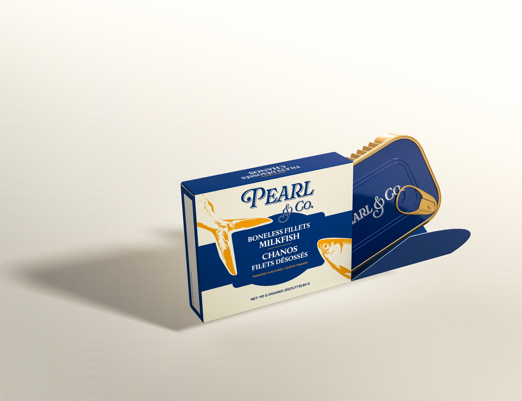
Visual Design & Style Guide: I developed a brand concept inspired by artisanal aesthetics, combining clean, contemporary layouts with warm, heritage-driven colours and typography. The design exploration balanced minimalism with bold storytelling so that Pearl & Co. communicates its values clearly towards its target audience.
Mockups & Prototypes: The mockups made showcase Pearl & Co.’s vibrant colours, clear typography, and premium feel in a real-world setting. The deliverables show the brand’s cultural story and sustainability values.


Results
Package Design:
Minimal layouts let vibrant colours and bold type shine, with product details kept clear for convenience. Inspired by artisanal and vintage cues, the design stands out on shelves while staying true to the brand’s roots.
Website:
The website mirrors the packaging’s clean, premium feel with bold colours, large lifestyle photography, and clear storytelling with spacious layouts and consistent typography keep it fresh and inviting.
