
Sculpt'd
Sculpt’d is a local Canadian ceramic company that makes art functional. The company is founded on the idea that art doesn’t need to be just a decoration. The brand prioritizes integrating functionality into modern art. Inspired by the overconsumption within this era, the wish is to reduce the number of purchases and cater to those who want high-quality pieces of art that are multipurpose.

Timeline
One month
Tools
Adobe Creative Suite, Blender, Figma
Challenge
Local businesses are vital to society, giving a sense of charm to cities with a unique sense of identity. One thing most local businesses may lack is the appeal of advertisement and design for their company.
The project is determined to showcase a fictitious local ceramic shop and make it shine by rebranding, allowing advertisements to cater to the modern and digital market.

Process
Research: To start the project, I aimed to create the brand based on understanding what to expect when dealing with what a target audience of financially stable millennials would find appealing. After that, I conducted primary research with surveys and interviews with various young adults whose ages ranged from mid-twenties to mid-forties. I've also conducted comparative analysis research to understand what is big in the modern ceramic digital market.
Analysis: Based on the research findings, I determined the preferences of the target demographic to be more interested in minimalistic functional art pieces and neutral-bold tones. When it comes to the brand's visuals, I developed the brand's identity from the research conducted.
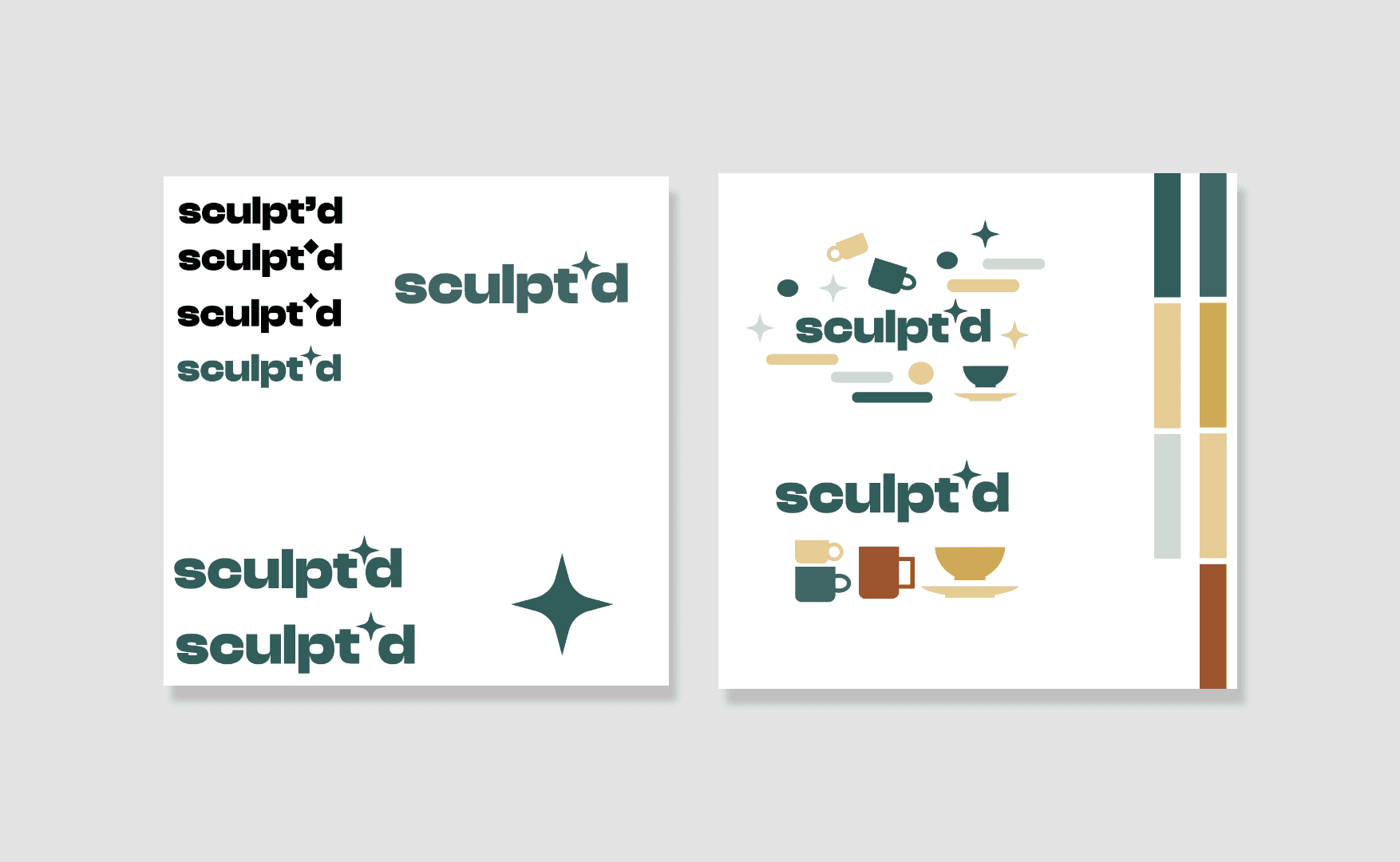
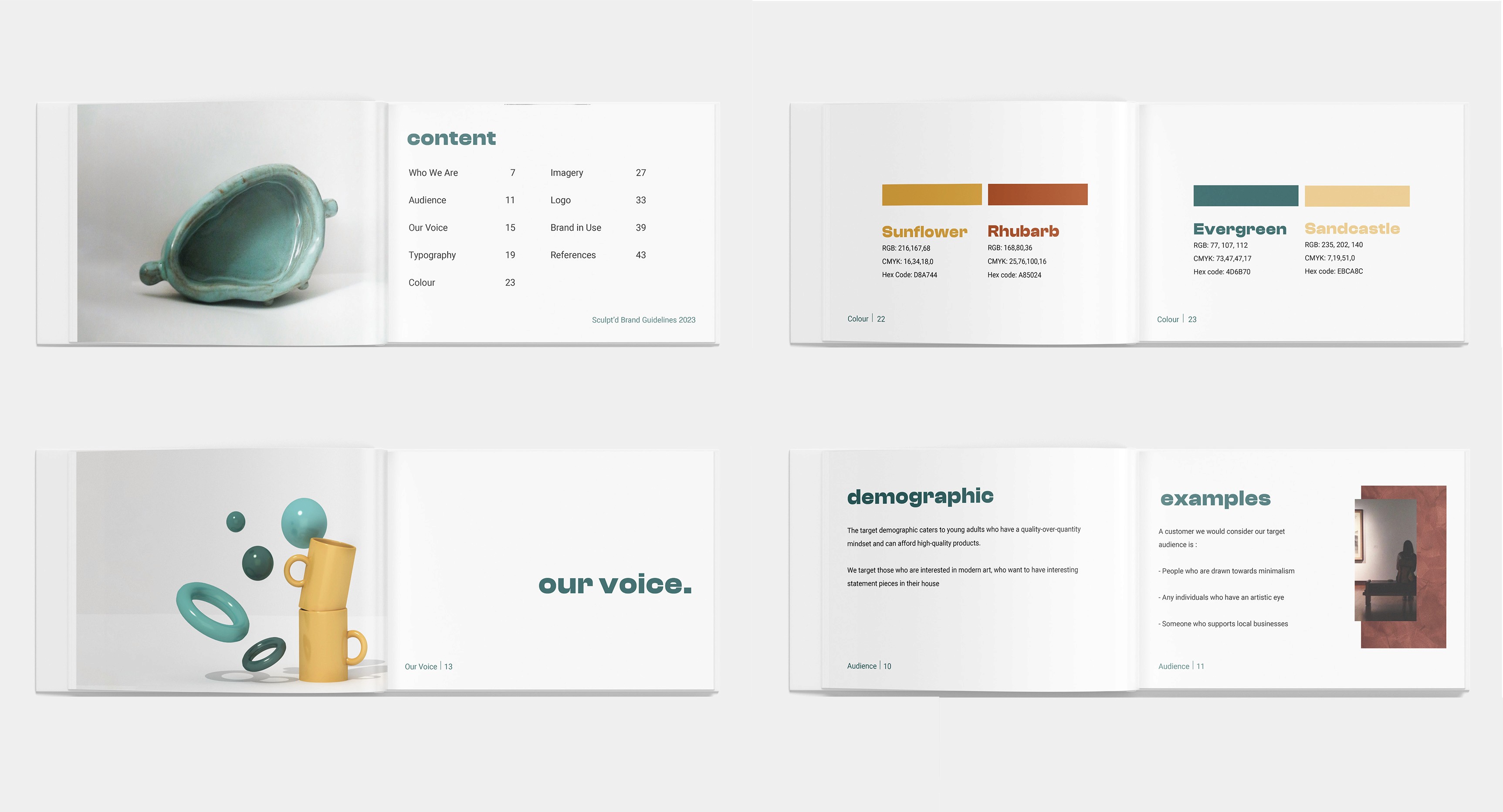
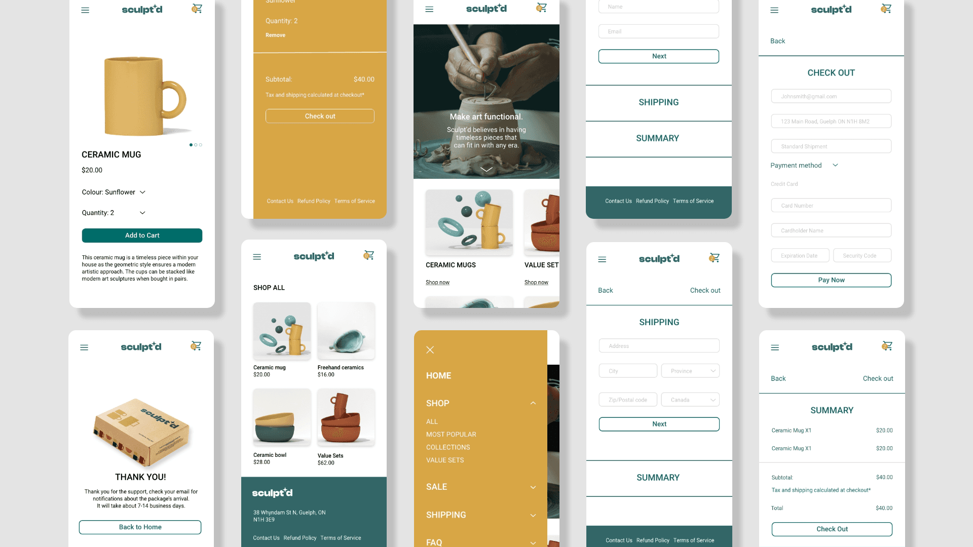
Visual Design & Style Guide: Sculpt'd developed a cohesive visual language, including colour schemes, typography, and iconography, ensuring consistency throughout the brand. I also created a brand guideline to maintain design consistency within the deliverables.
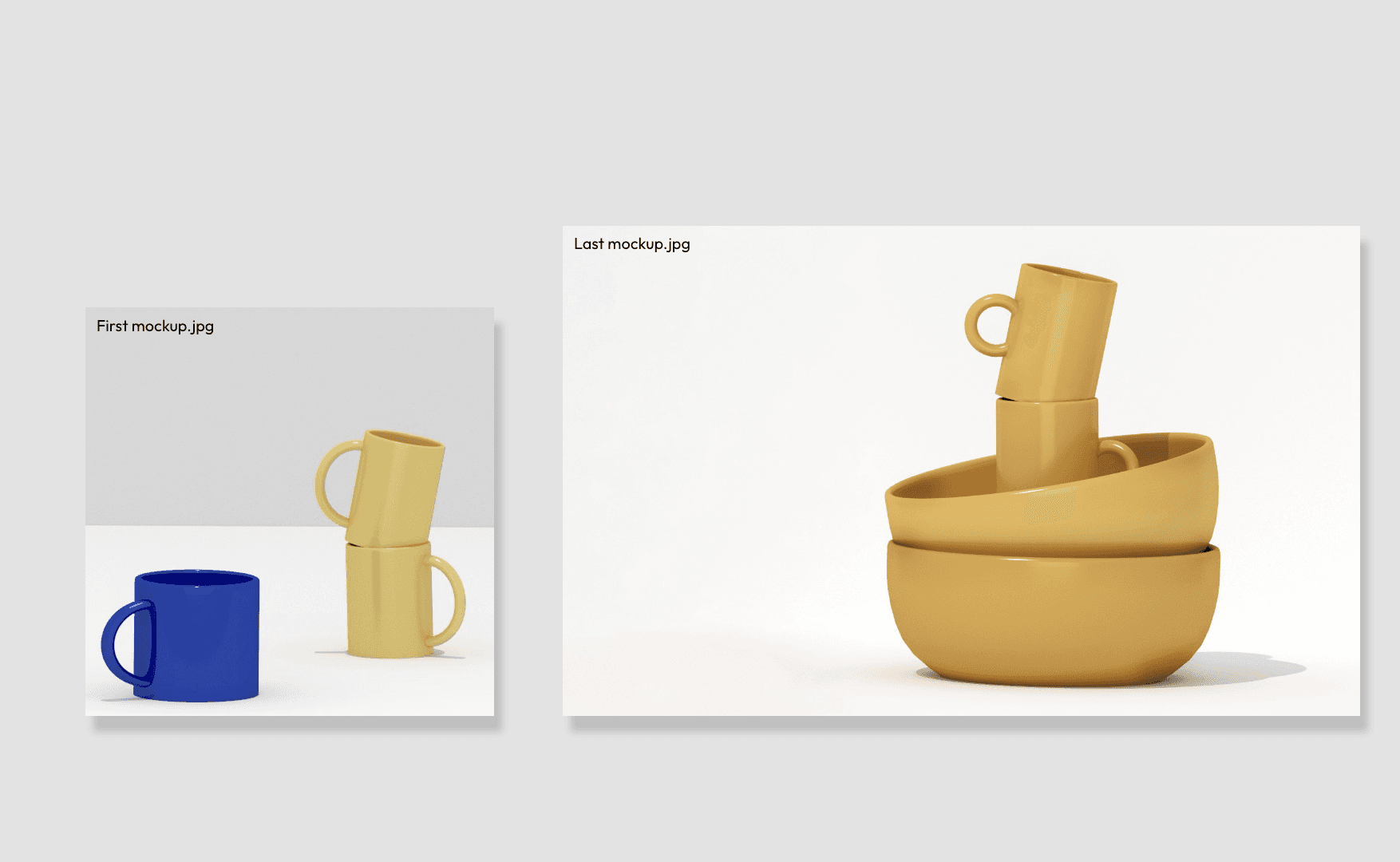
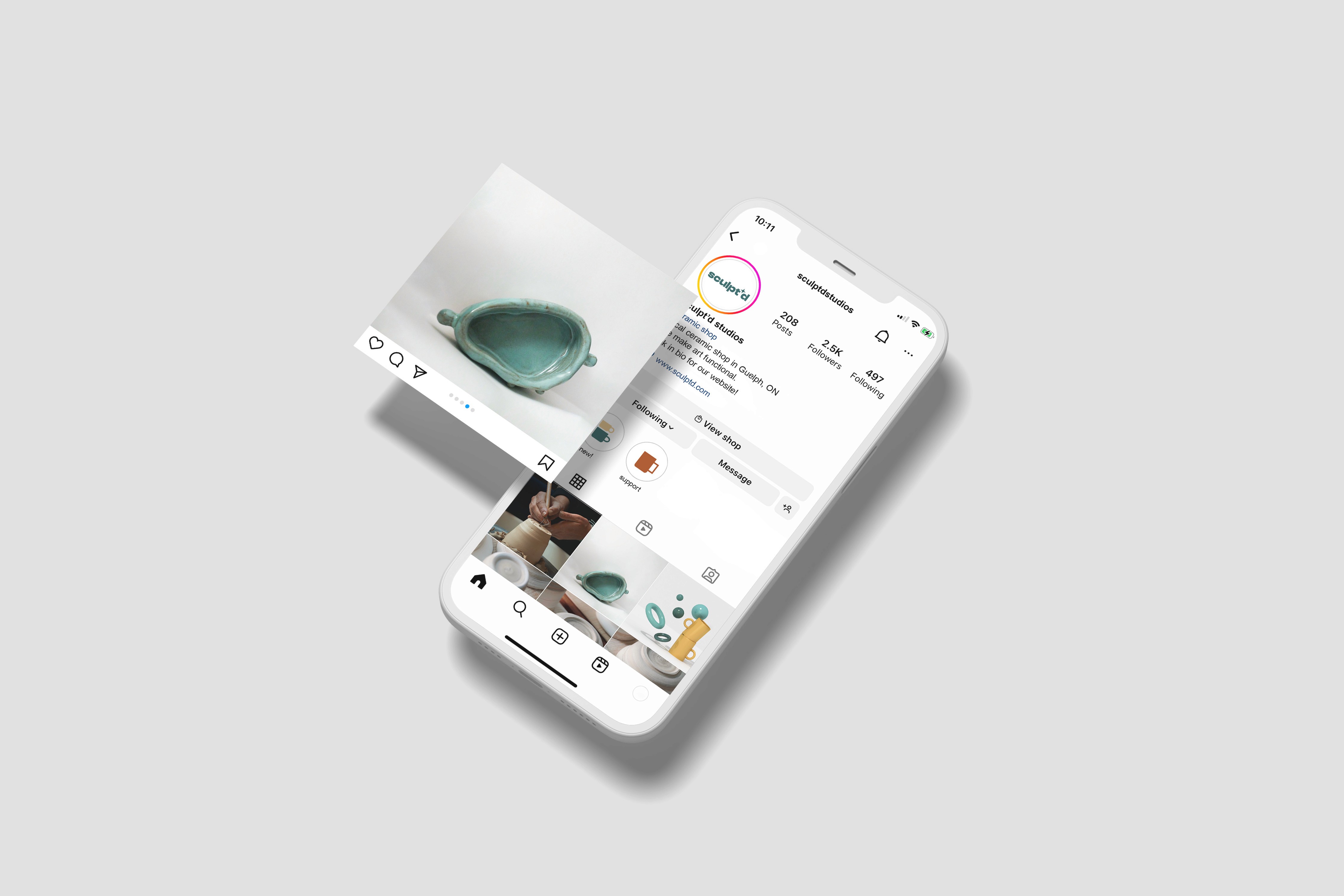
Mockups & Prototypes: I mocked up visual assets from Illustrator and Blender to visualize the products and imagery that the brand uses, refining them based on the style guide created. This helped me create a new wave of modern design for the brand, an example of this is when I created ceramics and imagety in Blender that resembled modern art.
Results
The rebrand featured is minimalistic and modern, making it more appealing to the demographic the brand was trying to reach. The colours used were a mix of neutral and bold tones that you could find within nature, which helps the brand appear more down-to-earth. The imagery used was to resemble geometric shapes. The simplicity of the imagery helped signify the brand’s voice by being adaptable and modern. The typeface of the logo is clash display variable bold, which brings personality and a sense of modernity to the brand. The type used for text is Roboto since it’s a clean and legible font. Both show a sense of digital design as they are both sans-serif fonts.

Reflection
I gained a lot of knowledge about the significance of brand cohesiveness and how even one deliverable that appears less coherent than the rest can have a significant impact on the overall project. When working on this project, I also learned to use research analysis from a variety of sources to support my design choices. For example, when it came to my UI design, collecting input from others taught me to consider it from the perspective of the viewer rather than my own.
