
Lola App Design
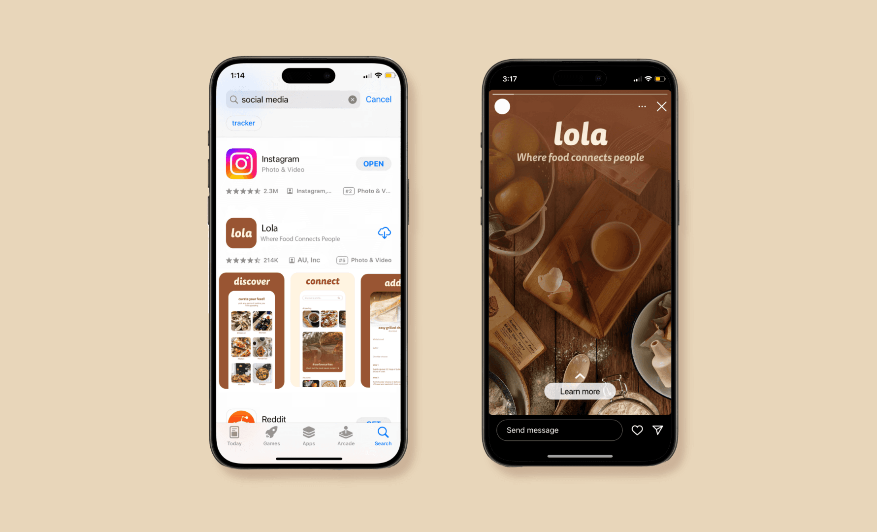
Lola is a cookbook social media app whose main goal is to bring communities together by connecting them with food and recipes. Inspired by my grandmother, Lola the app is a tribute to her, as well as the memories associated with cookbooks.
Timeline
5 weeks
Tools
Figma, Notion
Challenge
While social media's ability to connect contributes to bringing people close together, it can also lead some individuals towards bad habits and behaviours, such as an obsession with statistics such as followers, likes, and views which can lead others to feel disconnected from real people.
The project is determined to showcase a cookbook app that demonstrates the positive use of social media by connecting others through food.


Process
Research: Researched user accessibility and figured out why it's important. The app needs to pass the AODA standard for web-based design. To push towards light UX, the app needs to focus more on the user’s needs such as user-friendly design to further benefit the user.
Analysis: Emotional and behavioural psychology would help most with app design as it can help me understand how my target audience views certain features, such as encouraging behaviours like signing up for the app with words, colours, and other elements that make the user feel excited or welcomed.
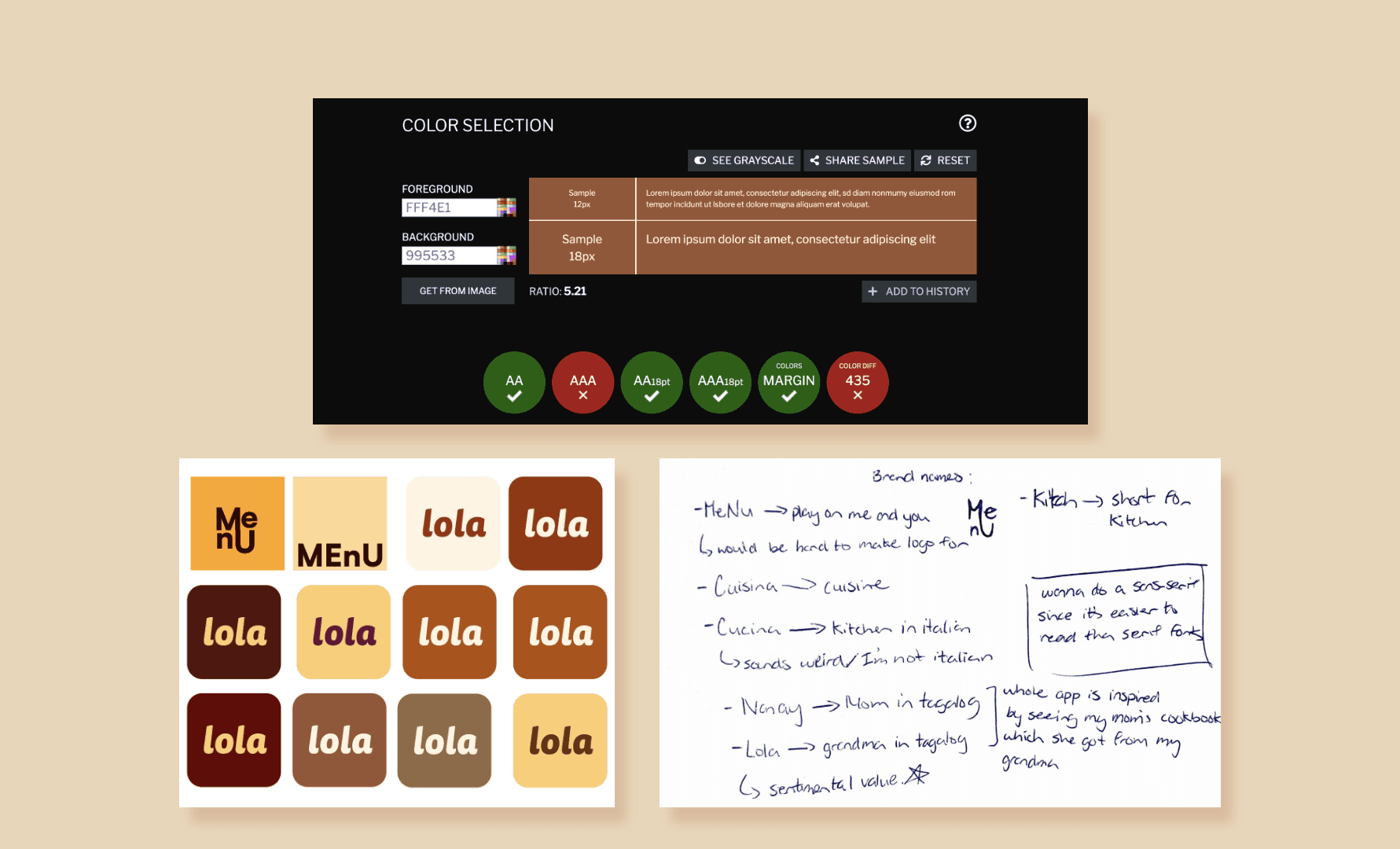
Branding: Keep minimalism in mind, use an element to stand out from the rest for my call-to-actions, and make my buttons bigger to click easier
Prototypes: To make a social media app, I need to take away the addictiveness of it (it takes up an individual’s time) and make it more related to connecting others and building a community regardless of location or background..
Results
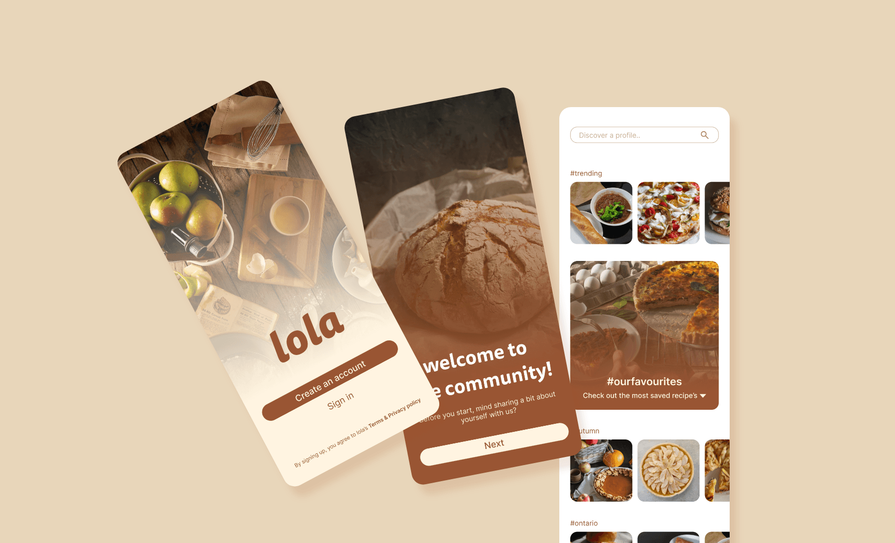
The app’s design is minimalistic, inspired by Hick’s law, the design aims to be simple and user-friendly to benefit users by making the interface intuitive and easy to manage. The app’s colours are brown and tan, reflecting the feeling of comfort. The typefaces used were Inter for body paragraphs and Tisa Sans Pro for the header. The rule used with the typeface Tisa Sans Pro is that within the app, the type must never be capitalized using this font, the lowercase gives a sense of unity and comfort. Inter was used as it is extremely legible and often used within web-based design.
