Hit Herbal Cigarettes
Hit Herbal Cigarettes is a fictitious cigarette brand that provides herbal cigarettes that are free from nicotine and tobacco. The brand prioritizes helping those battling addiction among adults. The name originally stemmed from the idea of hitting a cigarette when people get a nicotine craving. This plays on how the situation works, the idea is for someone to utilize herbal cigarettes and take these instead of ones containing additives.

Timeline
1 Month
Tools
Adobe Creative Suite
Challenge
Overconsumption is a big problem within the retail industry, many product packaging ends up in a landfill and is consumed through one-time usage. One thing some businesses lack is the use of sustainable packaging.
The project is determined to to create a sustainable package solution for the cigarette box, and a cohesive promotional campaign to advertise it.

Process
Research: I researched different substrates that went into creating sustainable packaging such as ink and material. I also researched a type of modern design that was both popular in the 90's and present since I realized I could target most adults with the approachability of nostalgia and trends. This also helped with sustainability as the packaging needed to be modern and minimalistic as well.
Analysis: Based on the research findings, I determined the most rationale design to use was Swiss design as it is a timeless modern design style that was slowly becoming more popular in 2022-2023 through social media platforms like Instagram and Pinterest.
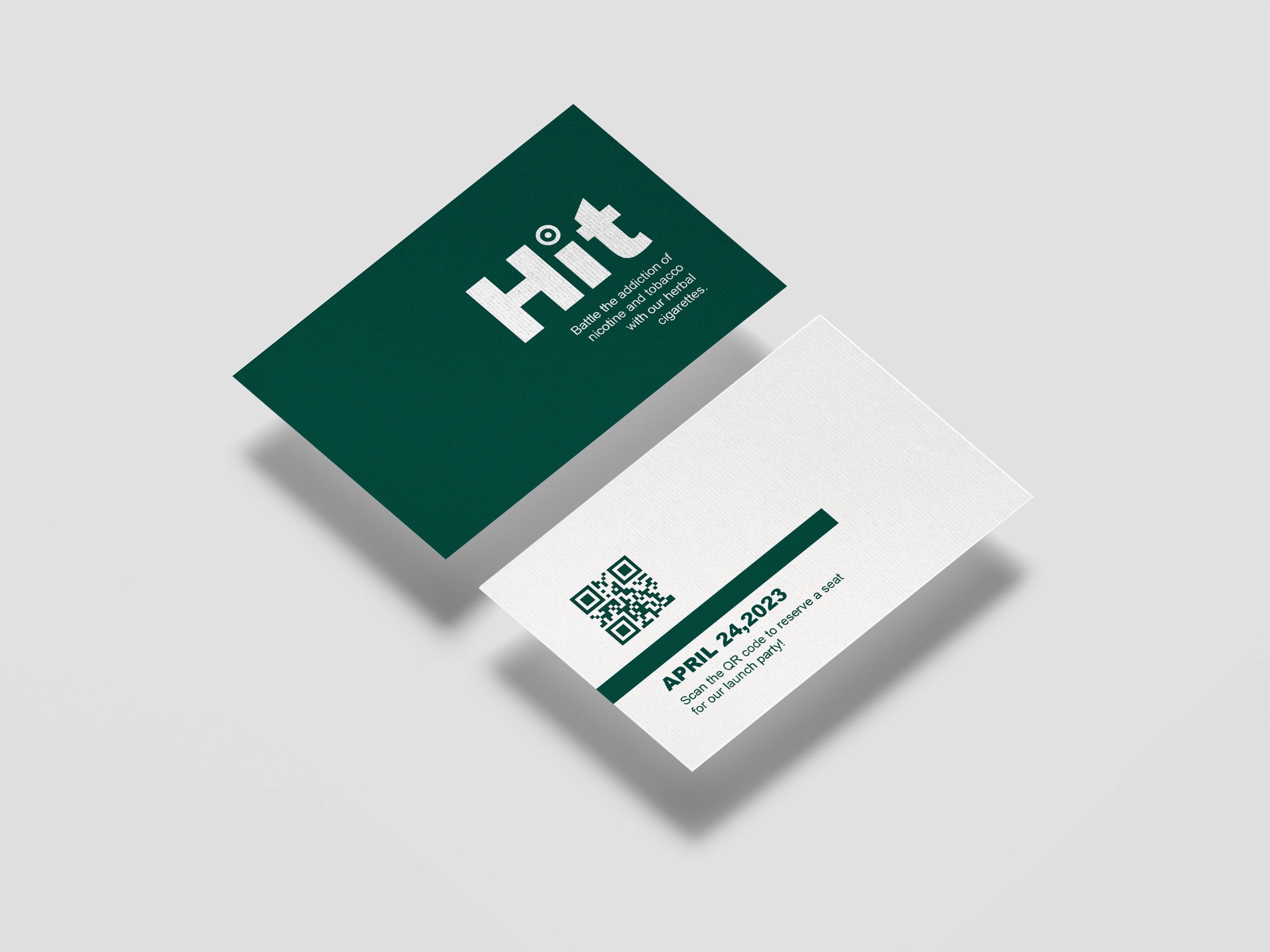
Visual Design & Style Guide: I developed a style guide to match the colours used, the typography, and the modern aspect of the design. The colours used were a dark green, black, and light beige to work in cohesion with sustainability in mind. The typography used was Ariel as it's a modern sans-serif,
Mockups & Prototyping: I mocked up physical product packaging, this helped me visualize what looked off such as colour or spacing.


Results
The product was heavily influenced by Swiss design, as seen by the use of hierarchy and simplicity in the packaging's visual design.
The product design would be using bagasse as a printing medium as it's compostable, offset printing since it's used for rough textures, and algae ink as it's the most sustainable ink variable right now.
The promotional campaign followed the style guide and kept very modern and minimalistic to be cohesive to the packaging.

Reflection
This was my first experience with creating packaging, let alone physically mocking it up. It gave me a sense of discipline and respect for the industry. I also learned a lot about modernism through this project, which led me to fall in love with the aspect of modern design.